Rafael Pavarotti’s photographs often announce themselves through color before the viewer has fully read the clothes or the setting. A saturated field establishes the space, a figure occupies it with clarity, and carefully arranged surfaces make the image feel constructed as a whole.
Rafael Pavarotti. Photographer opens October 2 at the Musée des Arts Décoratifs in Paris and continues through May 2, 2027. Vogue’s October 2 opening account confirms that the exhibition is now open to the public. The museum presents fashion editorials, campaigns, portraits, and personal work as parts of an evolving photographic language. Curator Sébastien Quéquet and scenographer Ibby Njoya provide a setting in which recurring decisions can be read across individual assignments.
Color organizes the frame
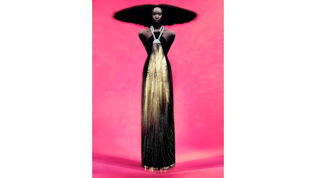
The museum’s featured photograph of Anok Yai provides a direct example. A vivid pink background surrounds a dark central figure. The hair extends broadly across the upper frame, while the dress creates a long vertical structure below. Bright linear details bring the eye back toward the face and the center of the garment.
The arrangement balances horizontal and vertical energy. The broad shape above prevents the portrait from becoming only a column. The dress gives that width a downward answer. Open pink space around both makes the silhouette readable before the smaller details resolve.
This is a useful distinction for photographers working with strong color. Saturation alone does not organize a picture. Its relationship with the subject’s outline, the surrounding space, and the bright points within the image determines whether the frame remains legible.
Here the background acts as an uninterrupted field. The subject’s face occupies a precise position within the dark upper shape. The garment’s luminous strands create an internal rhythm, drawing attention through the center rather than scattering it across the backdrop. These are visible compositional relationships, separate from any claim about the lighting equipment or production method used to make the image.
Surface gives the silhouette a second reading
From a distance, the portrait reads as a few decisive shapes. Closer inspection reveals different surfaces: hair, skin, dark fabric, and hanging reflective detail. Their contrast adds another level of attention within the same clear structure.
That two-stage reading matters in fashion photography. A strong outline can make a picture immediately recognizable, while texture rewards the time spent looking after recognition. Neither needs to overwhelm the other. Fine surface information becomes most effective when the overall frame already has a coherent order.
Photographers can approach their own images through the same sequence of questions. What is visible first? Where does the eye settle next? Does a highlight guide attention toward the subject, or pull it away? Those questions concern the finished picture and can be explored without copying another photographer’s palette or styling.
For a separate practical study of color relationships, Josef Albers’s Interaction of Color on Amazon I may earn a commission offers exercises in how neighboring colors change perception. The 50th-anniversary edition is a useful companion to that question, rather than a catalogue of Pavarotti’s work.
The portrait’s front-facing figure and controlled pose also give the clothing a stable visual structure. The picture’s energy comes from the relation between surfaces and shapes, rather than a visible burst of movement. Stillness can be emphatic when the composition around it has enough tension.
A museum sequence changes the assignment
An editorial photograph initially belongs to a particular publication, issue, or sequence. A campaign also has a client and a purpose. Bringing those pictures together allows another reading: the decisions that persist as the brief changes.
The museum’s official press release describes a thematic selection spanning commissioned and personal work, alongside material about the creative process. Sketchbooks, magazine spreads, and garments connect stages that a reader may otherwise encounter separately.
A sketch can show the beginning of a visual arrangement. A magazine spread shows how an image enters a designed sequence. A garment beside a photograph allows the viewer to compare a physical object with the image built around it. Each adds a different kind of context to photographic authorship.
The Musée des Arts Décoratifs is an apt setting for that comparison. Clothing, visual design, and photographic presentation meet inside an institution concerned with objects and their construction. The photograph remains a finished work, while the surrounding material can make its relationships easier to examine.
A recurring voice can span different briefs
The museum connects Pavarotti’s palette with his childhood in Brazil, his family, and the landscape around Belém. Those are attributed biographical sources for his work. The visible photographs provide the separate evidence of how color, staging, and figures actually function in a frame.
Keeping those levels connected and distinct makes the interpretation richer. A personal account can explain why a color matters to an artist. Looking closely can reveal how that color directs attention in a particular picture. A strong body of work allows both questions to remain active.
For commissioned photographers, the exhibition’s broader value lies in the possibility of continuity across changing assignments. A recognizable voice can come from how space is simplified, how surfaces are balanced, or how a figure meets the viewer. It need not depend on repeating one pose or one backdrop.
Looking across pictures reveals the decisions
The show’s curator and scenographer are important to that experience. Selecting pictures determines which relationships become visible. Their arrangement and surrounding colors affect the pace at which a viewer encounters those relationships. Exhibition design is therefore part of the presentation of the photographic argument.
For the current opening, the authoritative museum page gives the October-to-May dates and the Paris location. The exhibition offers time to compare images that usually arrive as separate editorial moments. A useful way to approach it is to watch what changes between photographs, then identify what remains consistent.
Pavarotti’s Anok Yai portrait already suggests a starting point: read the silhouette, follow the brightest details, and notice how the color field holds the arrangement together. Across a larger sequence, those concrete decisions can turn individual fashion images into a sustained account of photographic authorship.