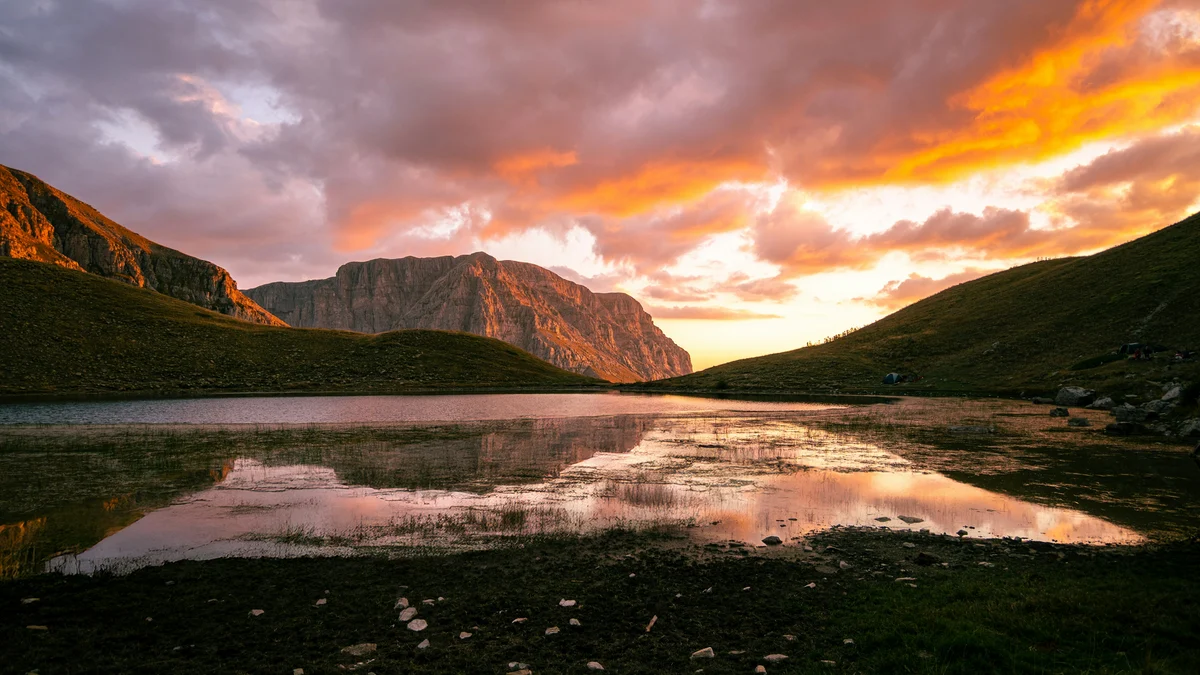
Contrast begins with a file that still has room to move
A sunset landscape can look flat before editing and brittle after only a few global adjustments. The problem is rarely a lack of available contrast. It is that the brightest sky, the darkest foreground, and the visual center need different treatment. Raising Contrast, Whites, Clarity, or Dehaze across the entire frame can strengthen one region while stripping texture from another.
A newly published Fstoppers lesson on high-contrast landscape editing follows photographer Christian Möhrle through a warm sunset file in Lightroom. His complete video walkthrough moves from cleanup and basic adjustments into masking, color grading, and sharpening. The transferable lesson is not a set of slider values. It is an order of operations that gives every tonal move a defined job.
The learning objective is building contrast by tonal region while preserving important highlight and shadow detail. This tutorial is for photographers who understand basic raw development but want a more controlled way to create depth in scenes with a bright sky and dark land. The expected experience is familiarity with exposure, highlights, shadows, white balance, and Lightroom's masking panel. The required equipment is a raw landscape file, a current version of Lightroom or Lightroom Classic, and a display on which highlight and shadow detail can be judged consistently. The access model is a free Fstoppers article with an embedded video, while Möhrle also provides the original video and a follow-along raw file from his channel.
First pass: protect the endpoints
Begin without trying to make the photograph dramatic. Correct the overall exposure, set a plausible white balance, and bring the file into a state where important highlights and shadows remain editable. Turn on the clipping warnings and watch the histogram while adjusting Exposure, Highlights, Shadows, Whites, and Blacks.
Adobe's current Lightroom Classic tone guidance defines clipping as pixels driven to the brightest or darkest representable value, where detail is lost. The red and blue preview overlays make the location of that loss visible. The photographic meaning of clipping matters more than forcing the histogram away from both walls at all costs. A tiny specular reflection may be allowed to reach white. A broad cloud bank that becomes a featureless white shape probably should not.
Use Option on macOS or Alt on Windows while moving Whites and Blacks to see which areas reach the endpoints. Back off until the important texture returns. If a highlight was irreversibly clipped in the original capture, a slider cannot recreate its missing structure. The goal is to preserve what the raw file recorded, not to make every pixel recoverable.
Second pass: make one global contrast decision
With the endpoints protected, decide what the whole frame needs. A restrained tone curve or a modest Contrast adjustment can establish separation between the broad tonal groups. Stop before the sky loses color or the foreground turns into an undifferentiated block.
Clarity and Dehaze deserve special restraint. Adobe describes Clarity as a local-contrast control and recommends checking for halos at 100 percent. Dehaze can strengthen or soften atmospheric separation. Möhrle's example moves both controls downward to create a softer glow before rebuilding definition locally. That choice works because the scene is warm and luminous. Another file may need no such reduction. Use the controls to support the light already present, not as a recipe to copy.
A useful test is to toggle the global adjustment off and on while looking separately at the brightest cloud, the horizon, and the darkest textured foreground. If one move improves all three, keep it. If it helps only one region and harms another, its job belongs in a mask.
Third pass: assign contrast by region
Open the masking panel and name each mask by purpose, such as deepen blue sky, hold sunset highlights, open foreground, or guide center. Adobe's current Lightroom masking guide documents linear and radial gradients plus color and luminance range selections. Those tools can overlap, intersect, and subtract, which is the basis of a controlled regional edit.
Start with the sky. A linear gradient can darken its upper edge gradually, while a color range can isolate blue tones without dragging the warmer horizon in the same direction. Then place a broad radial gradient over the visual center and raise Exposure slightly. If that lift starts to flatten the bright sky, reduce Highlights inside the same mask or subtract the vulnerable area.
Treat the foreground as a separate relationship. Darkening the nearest edge can lead attention inward, but complete black removes texture and spatial cues. Raise Shadows or Blacks in a more selective mask if needed, then compare the result at Fit view and 100 percent. A strong image can contain deep shadow. It should still make clear whether that darkness describes form or merely hides it.
This method is a digital continuation of regional print thinking. Kisau Photography's discussion of darkroom printing and Lightroom masks connects contemporary masks with the older practice of deciding what should be lighter, darker, stronger, or quieter in a print. The tools differ, but the photographer still assigns emphasis area by area.
Fourth pass: pair every move with a protection check
Contrast is a relationship, so each local move deserves a check at the other end of the tonal range. After brightening the center, inspect the sky highlights. After darkening the upper sky, inspect whether clouds have become heavy or color has shifted unnaturally. After opening the foreground, inspect whether noise and weak detail have become more visible.
Think of this as a contrast budget. The file can support only so much separation before transitions, color, or texture begin to look artificial. Spend the strongest contrast where the eye should arrive. Use smaller adjustments elsewhere to create a path toward it. Newsroom's analysis of depth-based masking reaches a related conclusion: the best mask follows the visual reason an area needs different treatment. In this Lightroom exercise, that reason may be tone, color, position, or subject importance.
Fifth pass: grade color after the tonal structure works
Color grading cannot rescue a confused tonal design. Once the light-dark relationships hold together, refine the palette. Cool the upper sky if the recorded blue needs separation, protect the warm horizon, and use HSL or Color Grading only as far as the light remains believable. Watch individual channels as well as overall brightness because a red sunset can clip in one channel before the composite image appears fully white.
Finish with a diagnostic pass. Toggle each mask individually. Inspect hard edges around trees and ridgelines, halos at the horizon, excessive saturation near the sun, noise in lifted shadows, and patches where two gradients overlap. Then compare the edited image with the clean base, not only with the immediately previous step. The current usefulness of this workflow is that Lightroom's 2026 masking tools make regional adjustments fast while leaving every decision editable and auditable. Its limitation is equally important: it cannot recover detail that the camera never recorded, guarantee accurate output on an uncalibrated display, or turn a weak lighting relationship into a convincing one.
For practice, use one high-dynamic-range landscape and make five snapshots: clean base, restrained global contrast, sky mask, foreground and center masks, and final color grade. Compare them at Fit view and 100 percent. Related resources include Adobe's current tone and masking documentation, the source video, and an exported proof viewed on the device or paper that matters to the final use. A strong result should feel more dimensional at each stage without requiring the sky to become blank or the foreground to disappear.