The bow travels well between a drawing and a dress. In Megan Hess's new behind-the-scenes account of the LEO LIN × Barbie collaboration, it becomes a connecting device: small and repeated on some garments, enlarged into a focal point on others, and carried through her illustrated fashion figures.
Hess's account , published October 6, opens the studio process behind the capsule. It introduces a fashion idea with several distinct authors: Barbie as the shared character, Hess's illustration, and LEO LIN's garments. The collection itself was already introduced by the label. The new story is the closer view of how its drawings and clothing relate.
A pink collection with more than one silhouette
The official LEO LIN collection uses pink as a consistent visual field. Within that field, shape does much of the work. The photographs accompanying Hess's account place an off-the-shoulder long dress, a tailored jacket with a long skirt, and a shorter, fine-strapped dress together. Their common color makes their differences easier to see.
The long off-the-shoulder design gathers fabric around the neckline, establishing a broad horizontal edge above a comparatively uninterrupted body. Its scattered small bows supply points of detail without turning the whole surface into a dense pattern. The eye can move from the neckline down through those accents while the larger silhouette remains clear.
The jacket and skirt create another rhythm. Lapels, a fitted waist, and the line of the buttons give the upper garment a more structured appearance. Beneath it, the long skirt extends the vertical movement. A larger bow near the neck establishes a focal point, while smaller bows continue across the outfit.
The shorter dress uses a closer upper outline and a skirt that opens below it. Fine shoulder straps leave more space around the neckline. Here the bows register against a more compact form. The motif stays recognizable, but its placement and scale alter the way it participates in the silhouette.
These are observations of the supplied photographs. They explain why a capsule can read as coherent without requiring every piece to have the same cut. Color and repeated detail establish the family resemblance, while proportion gives each garment its own role.
Illustration can make the design relationship visible
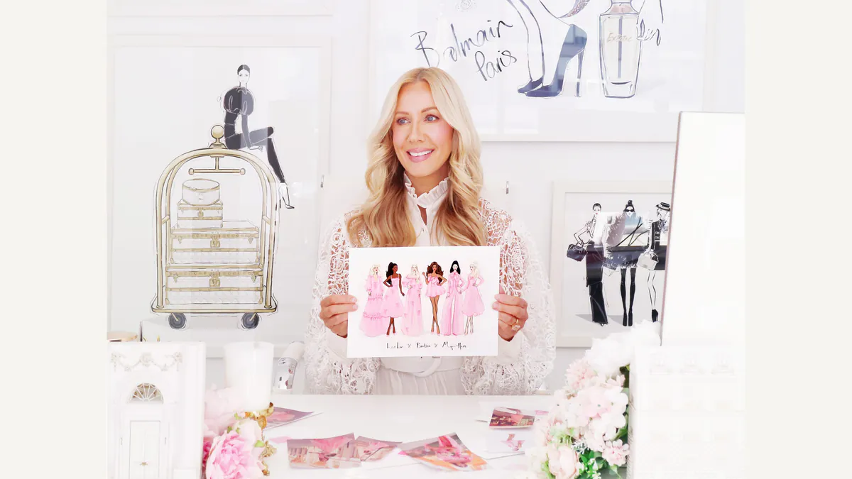
Hess's studio photograph shows her holding a row of illustrated figures dressed in pink. The figures sit against a white page, with enough separation to make their different outlines readable. That arrangement invites a comparison of garments as shapes before the viewer turns to fabric or fit.
A fashion illustration compresses decisions. A line can make a hem, waist, sleeve, or bow immediately legible. Empty space around the figure becomes part of the presentation, allowing the eye to follow a silhouette without the competing information of a location or crowded scene.
The photographed clothes add another layer. Fabric falls under its own weight, gathers around a body, and catches light across folds. A drawing can emphasize the intended contour, while a photograph shows how a particular sample is presented on a wearer. Looking between the two gives the collaboration its most useful visual conversation.
Hess describes drawing Barbie in the LEO LIN pieces and working with the label on the project. Her account connects the capsule to her book, Barbie: A Fashion Icon. The label's own story also identifies that illustrated starting point. Both are participant accounts of the collaboration, with the visible work supporting the design reading here.
The bow is both a mark and a piece of volume
On paper, a bow can be established with a few curves and a suggestion of folded ends. In clothing, those ends and loops occupy space. Their projection changes how light describes them and how they sit against the garment beneath.
That makes scale consequential. A small bow can function like punctuation across a dress. A large bow can become the dominant feature near the face or neckline. Repeating the smaller form can distribute attention, while enlarging it can concentrate attention in one place.
The capsule's pictured looks use both possibilities. Their pink surfaces keep the repeated bow closely related to the surrounding garment, rather than treating every accent as a sharp color interruption. The detail becomes visible through its outline, relief, and placement. This is an effective way to sustain a playful motif while leaving the overall form legible.
A character becomes a design vocabulary
Barbie provides a familiar identity for the collaboration. The fashion interest comes from the specific choices made with that identity: a shared color, an illustrated line-up, a recurring bow, and several differently proportioned garments. Those choices give the project more to look at than its name alone.
Hess's account also shows the illustration moving onto a scarf associated with the capsule. That adds another translation, from a page of figures to a textile object. The drawing can accompany the clothing as a separate surface, carrying the collaboration's visual language at a different scale.
The behind-the-scenes material makes these relationships visible together. It offers a clear way to read creative authorship across a collaboration: follow the motif from the artist's page into the garment, then notice what changes when a drawn line becomes a seam, a fold, or a projecting bow. The pleasure of this capsule lies in that movement between image and clothing.