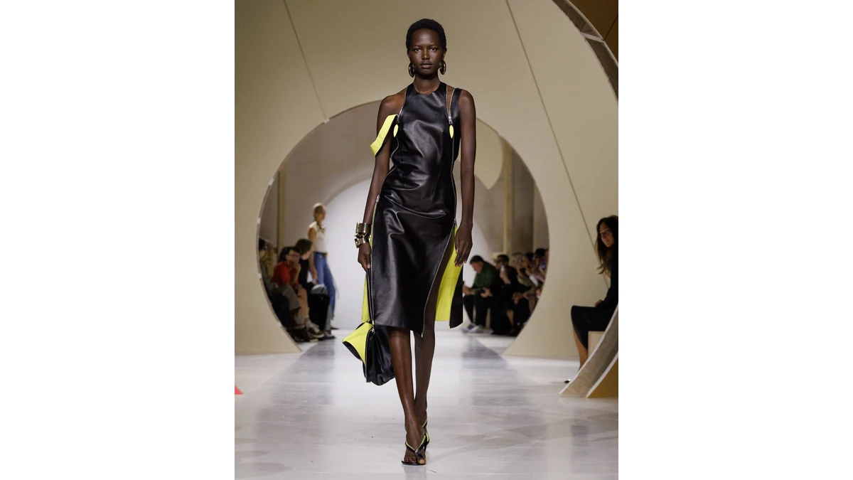
A clean silhouette with an active edge
Sarah Burton ’s opening look for Givenchy in the official collection gallery establishes the visual argument. Its main surface is black, with a broad, uninterrupted area across the front. Yellow appears at the sides and lower edge, making the boundary between exterior and interior unusually conspicuous. The garment reads as a strong shape and as a construction that can open.
That pairing makes the dress interesting beyond its first impression. The black surface gives the eye a continuous form to follow. The yellow interrupts that continuity at specific points, directing attention toward the garment’s openings. Even in a still photograph, those contrasting edges suggest movement and a change in how the dress presents itself as the wearer walks.
The bright interior also gives a practical visual lesson in how a small amount of contrast can organize a silhouette. It need not spread across the whole garment to be effective. Placed near an opening or hem, color can describe where one layer ends and another begins. Here, the edge carries much of the picture’s energy.
The house’s collection statement describes Burton’s interest in balance and clarity. The opening dress makes those words tangible through a controlled central shape and a more animated perimeter. Its precision has a visible result, rather than serving only as a general description of craftsmanship.
Tailoring redirects the familiar
In the October 4 collection account , Claudia Croft emphasizes cut, silhouette, and the relationship between leather and softer-looking drape. Those observations invite a close look at how the collection changes familiar garment categories while keeping them recognizable.
A jacket can remain legible as tailoring even when its fronts overlap or its proportions shift. A trench shape can retain its recognizable vocabulary while a flap interrupts the expected balance. That is a productive space for design because the viewer brings an existing understanding of the garment. A changed line can become meaningful against that familiar starting point.
The collection’s clarity should therefore be understood through arrangement. A clean outline can contain an unexpected overlap. A seemingly direct garment can place an opening where the eye does not anticipate it. Such decisions make the act of looking more active. They reward attention to the parts that define a shape instead of asking decoration to carry the whole impression.
For readers following Burton’s work, that focus on cut provides a useful way into the season. Begin with the outer contour, then examine how the front, shoulder, waist, and hem are connected. The shape emerges from those relationships. Looking this way makes a runway gallery more informative than sorting garments into simple categories such as restrained or dramatic.
Suspension changes the evening line
Nicole Phelps’s collection report identifies fine jersey supported by brass wire among the evening experiments, with Alexander Calder’s Cirque Calder as a reference. The detail introduces another method of organizing cloth: a shaped support can establish a line from which softer material falls.
That construction suggests a useful contrast with tailoring. In a jacket, the fabric and its seams help build the form. In a suspended arrangement, a support establishes a point or curve, while the hanging cloth describes gravity beneath it. The finished silhouette depends on both elements. One supplies a boundary, and the other makes movement visible.
The reference also gives the collection an artistic context without turning a garment into a literal costume. The Calder Foundation’s account of the artist’s work provides background for readers exploring his constructions and performance practice. In this collection, the relevant design question is how a relatively slight support can organize a much larger area of cloth.
Viewed alongside the leather opener, the evening construction extends the same interest in edges. One look makes an opening conspicuous through contrasting color. Another allows a support to determine how material is held. Both approaches direct attention toward the relationship between a garment’s structure and its movement.
A vocabulary for reading the clothes
The Fédération de la Haute Couture et de la Mode records the collection’s October 2 presentation. Its gallery and the house’s own lookbook offer two useful routes for examining the season. Readers can move between a complete silhouette and the details that establish its proportions, with the presentation date kept distinct from later reviews.
Construction vocabulary helps make those observations more precise. An opening, lapel, sleeve, flap, or hem does a different job within a garment. Naming the part lets a reader describe what changed and where it changed. It also makes a comparison between two looks more useful than a broad statement that they share a mood.
Fashionary ’s visual reference Fashionpedia covers garment details, materials, and manufacturing terminology. The verified English hardcover Fashionpedia: The Visual Dictionary of Fashion Design I may earn a commission offers related background for readers interested in the language of construction. It is a general design reference rather than a book about this Givenchy collection.
The season’s strongest invitation is to look at how the clothes are made to hold a line, reveal an edge, and accommodate motion. Burton’s announced desire for clarity takes several forms across the available images. A continuous leather surface, a redirected tailored front, and suspended jersey can each make structure legible in a different way. Together, they give precision an expressive role within the wardrobe.