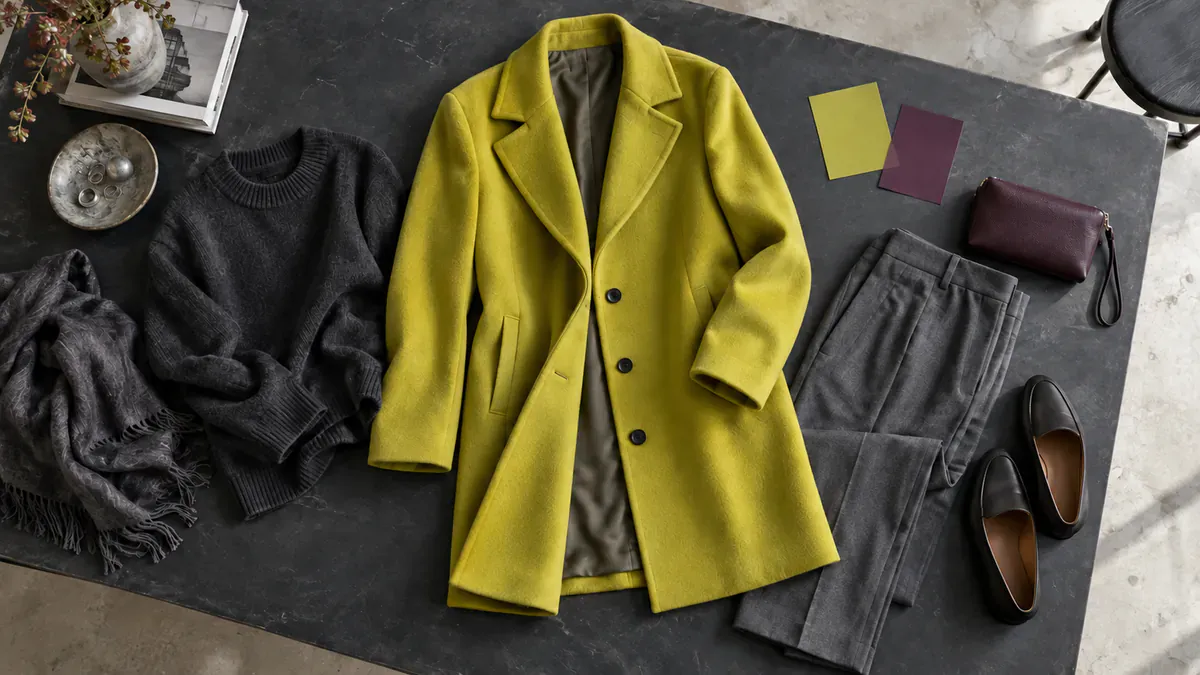
Put a chartreuse scarf beside a charcoal jacket and the eye has a new place to land. The jacket keeps its familiar outline. A small area of yellow-green changes how the whole arrangement reads. That is an inviting way into the color: begin with an accent, then decide how much attention you want it to hold.
A September Vogue Italia report follows chartreuse across autumn collections and shopping interest. Its runway examples give the color a seasonal setting. Its appeal in a wardrobe is easier to explore at a smaller scale, among the browns, burgundies, dark denim and charcoal pieces already there.
The numbers need a little untangling. Vogue Italia cites a 28 percent rise in Lyst searches. Lyst’s own August 21 Great Fashion In-Between note reports chartreuse searches up 40 percent week on week, while pistachio rose 28 percent quarter on quarter. Different shades and time periods sit behind those figures. They describe attention on one shopping platform, rather than global sales or a color everyone is wearing.
The runway examples come in several shades
Vogue Italia points to autumn-winter 2026 and 2027 collections from Miu Miu, Zimmermann, Mugler and Prada, often pairing chartreuse with burgundy. An earlier Fashionista pre-fall review found yellow-green shades at Victoria Beckham, Rabanne and Ulla Johnson, alongside deeper khaki elsewhere. The range is useful to keep in view. A pale pistachio and an acidic yellow-green can suggest very different outfits despite appearing close on a color chart.
The Independent’s May report follows the color through spring and summer runways, public appearances and Clearpay shopping data. Its suggestion to begin with an accent leaves room for personal preference. A scarf, shoe or bag can introduce the shade without asking the rest of a wardrobe to follow it.
These records give several views of a developing color story: collection styling, public appearances and shopping searches. They do not have to add up to a seasonal takeover to offer something enjoyable. One unexpected pairing can be a useful discovery even if it never becomes a uniform.
Give the color a role, then choose its scale
The background on chartreuse as a color places it between yellow and green. In clothes, surface adds another variable. Imagine the same hue in satin, brushed wool and a dense knit. Shine, softness and the size of the colored area can change its presence before the cut of the garment changes at all.
Charcoal gives the yellow-green a dark, relatively quiet surround. Burgundy or plum brings a second strong color into the conversation. Brown offers an earthier contrast, while denim lets a bright accessory sit among familiar textures. None is a rule. Each pairing gives the eye a different balance to explore.
Cream offers another possibility. A pale background can let the color become part of a lighter arrangement rather than the only bright point in a dark outfit. Keep the outline simple at first so it is easier to see what the fabric and neighboring shade are doing.
Scale changes the effect again. A coat gives chartreuse a broad shape. A fine knit under a jacket breaks it into a smaller area. A glove or shoe places the color at the edge of the silhouette, where it may appear and disappear with movement. The choice is less about permission to wear a bright hue than the role you want it to play.
Before buying anything, place a possible piece beside clothes you would actually wear with it. Look in daylight and under the light where you usually get dressed. A phone photograph can help reveal the overall balance, though the screen has its own color rendering. The fabric in front of you remains the better reference for its actual shade.
Let neighboring colors do some of the work
Chartreuse sits alongside deep reds, purples, browns and other earth tones in the season’s reporting. Fashionista’s pre-fall survey makes that range clear. A color becomes more interesting when it has company: the dark red beside it, the amount of skin between it and a shoe, or the fabric that stops two neighboring shades from merging.
The commercial context belongs beside the trend figures. Vogue Italia includes shopping links, Lyst is a shopping platform, and none of the cited reports supplies audited global sales. Their examples still give readers concrete combinations to examine. Keep the styling discovery separate from the size of the market claim.
That leaves plenty of room for a choice to feel personal. Someone drawn to a full coat and someone curious about one scarf can explore the same hue at different scales. Neither needs to reproduce a runway look for the color relationship to work.
A dated trend can still offer a lasting pairing
Comparable search periods, retailer assortments and repeated public styling would make a stronger case for lasting reach. For now, the dated figures describe a burst of interest. They supply context for the color rather than a reason to replace clothes that already work.
Return to the charcoal jacket and the scarf. Move the yellow-green from the neck to a bag at the hip and the eye takes another route through the outfit. The color stays the same, yet its placement changes the picture. That small decision is where the useful part of the trend becomes yours.